Apple Website Re-Design
Project:
UX Evaluation Case Study
Duration:
3 months
Overview:
This project proposed improvements for the Apple website's purchase process. A UX evaluation was conducted forming this case study researching into the efficiency of purchasing a product through the Apple website. Usability tests were conducted to identify issues with the current process through think-aloud protocols, aiding the proposed re-design of Apple's interface.
Software Used:
- Figma
- Photoshop
- Mural
Identified Problem:
A UX evaluation of Apple's website purchase process was conducted identifying many users find the website unfavourable and proceed to purchase Apple products from other tech providers.
My Responsibilities:
- User research
- Competitor analysis
- User personas and journeys
- Concept designs
- Usability tests
- User Interviews
- Wireframes
- Proposed screen redesigns
Project Process:

- Research - background, website design, user expereince, demographic
- Define - user flow diagram, personas, user journeys
- Gather Data - usability testing, think aloud protocols, interviews
- Ideate - development sketches, finalised sketches
- Prototype - Figma screens
01 Research
The research phase provided useful context through understanding Apple as a brand, their mission and values allowed for understanding of their key target demographics.
Background Research:
Apple, famous within the electronic sector for their high quality products and simplistic design was founded in 1976 by Steve Jobs, Steve Wozniak and Ronald Wayne.
Apple make it their mission to put the users experience at the forefront of their products, reflecting this through their brand and their website design. Having developed loyal customers through their use of product quality and recognisable design.
Website Design:
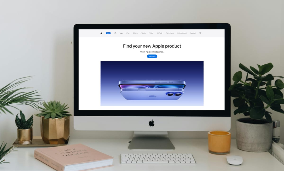
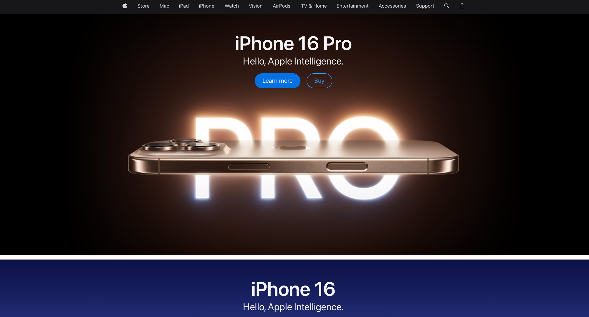
Apple's website reflects its high-quality products through:
- Black and white colour scheme
- Simplistic sans - serif font
- Minimalistic icons
- Design consistency
- High quality images and visuals
Home Page Example:
User Research:
Demographic statistical research showed the majority of Apple customers are:
- Young Adults
- Professionals
- Students
- High Earners
Global demographics showed Apple makes most of their revenue from:
- North America
- Europe
- China
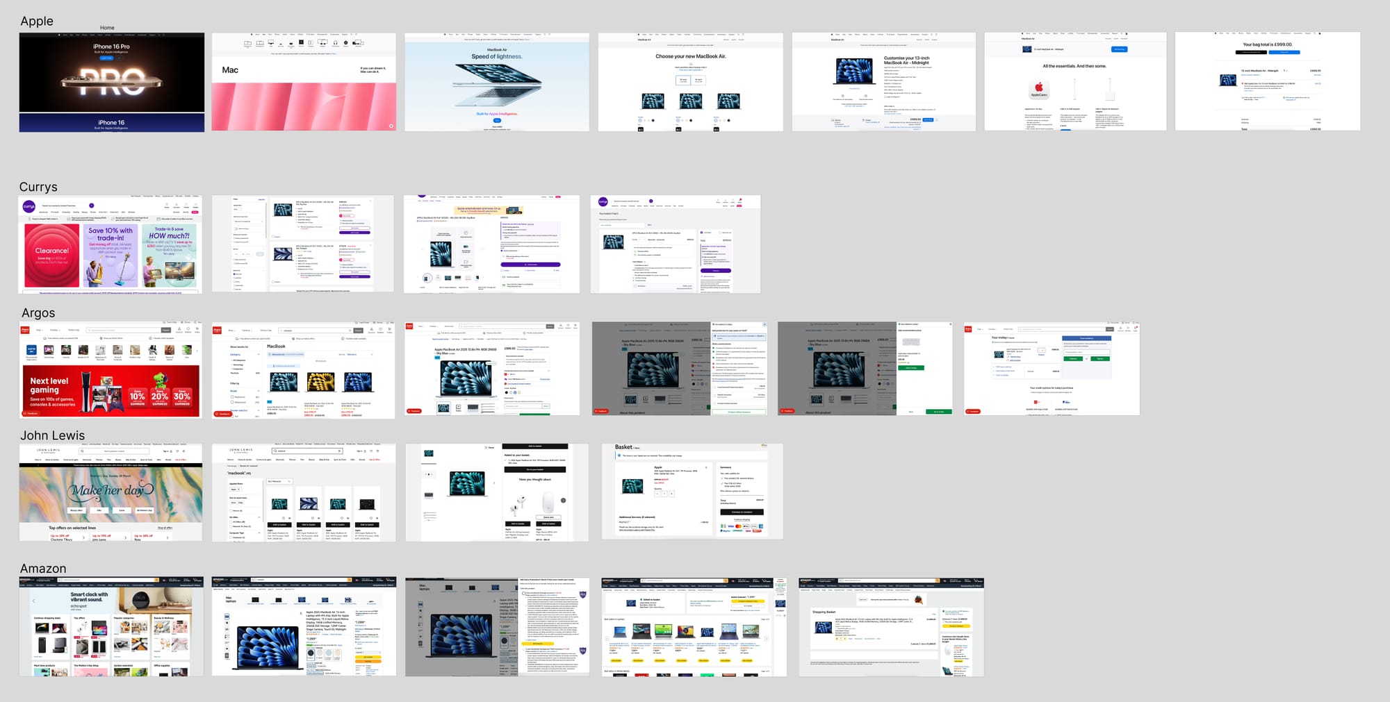
Competitor Analysis:
A competitor analysis of Apple's biggest competitors revealed that Apple's purchase process requires too many steps - involving high-resolution images and scrolling.
02 Define
The define stage allowed for identifying the main issues in need of development. Understanding the navigation of the Apple website defined the process of purchasing a product, allowing the pinpoint of potential user pain points through user journeys and personas.
User Flow:
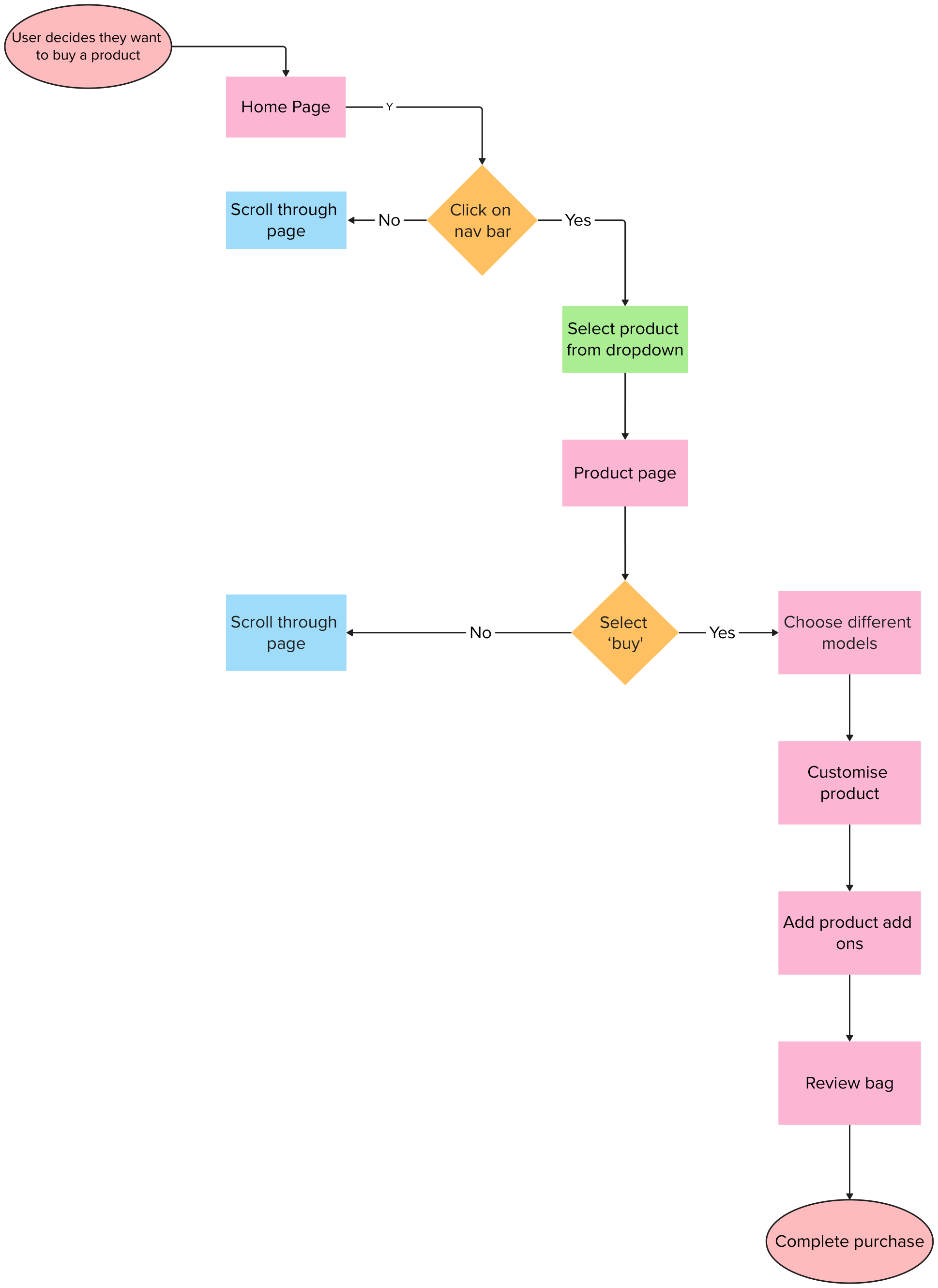
Testing the Apple website a user flow was mapped out, displaying what purchasing a product looks like. This allowed me to identify users' decisions and steps through the website.
Identified Key Steps:
With the user flow map, each step in the process was pinpointed.
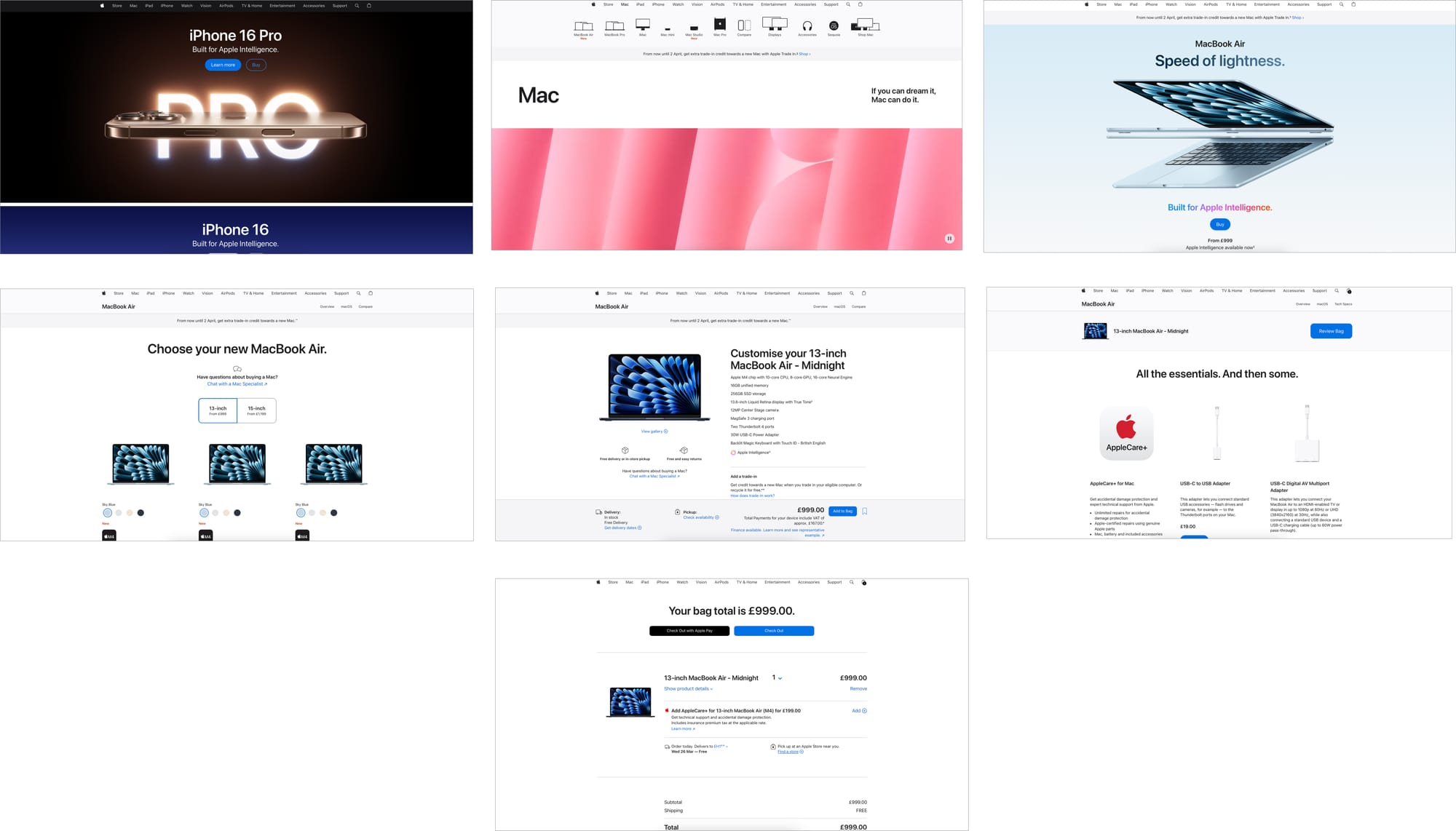
Step 1: Home Page
Step 2: Navigating to the Chosen Product Section
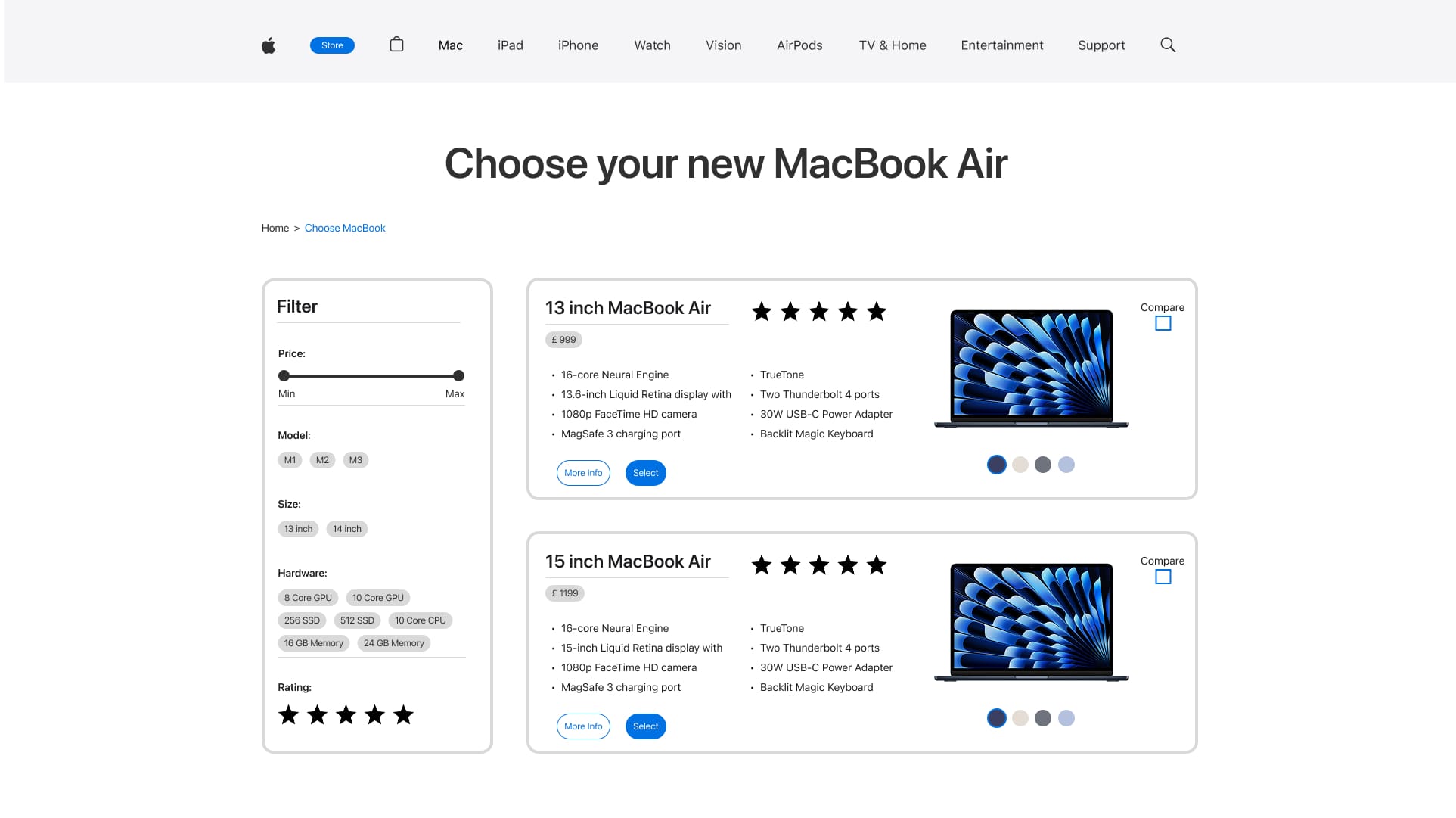
Step 3: Choosing Product from Selection
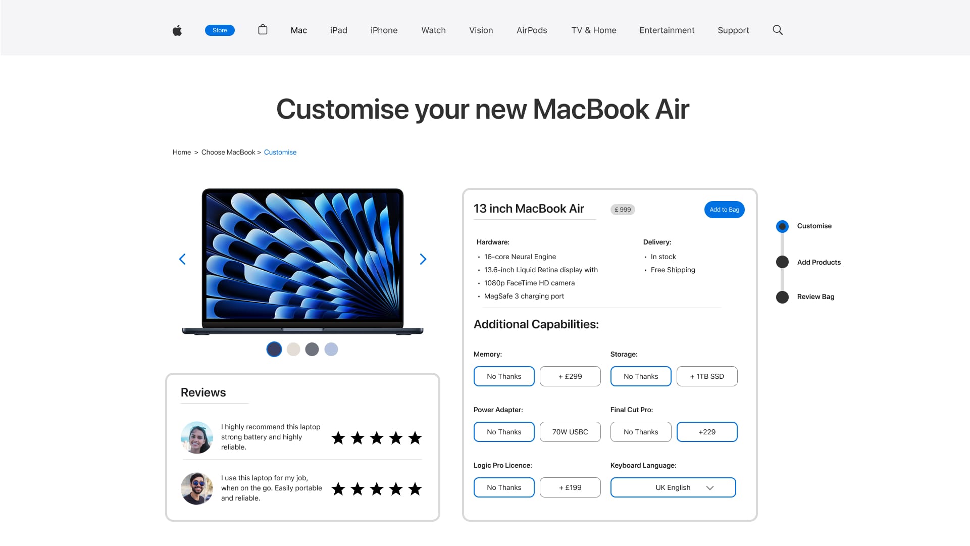
Step 4: Customise Chosen Product
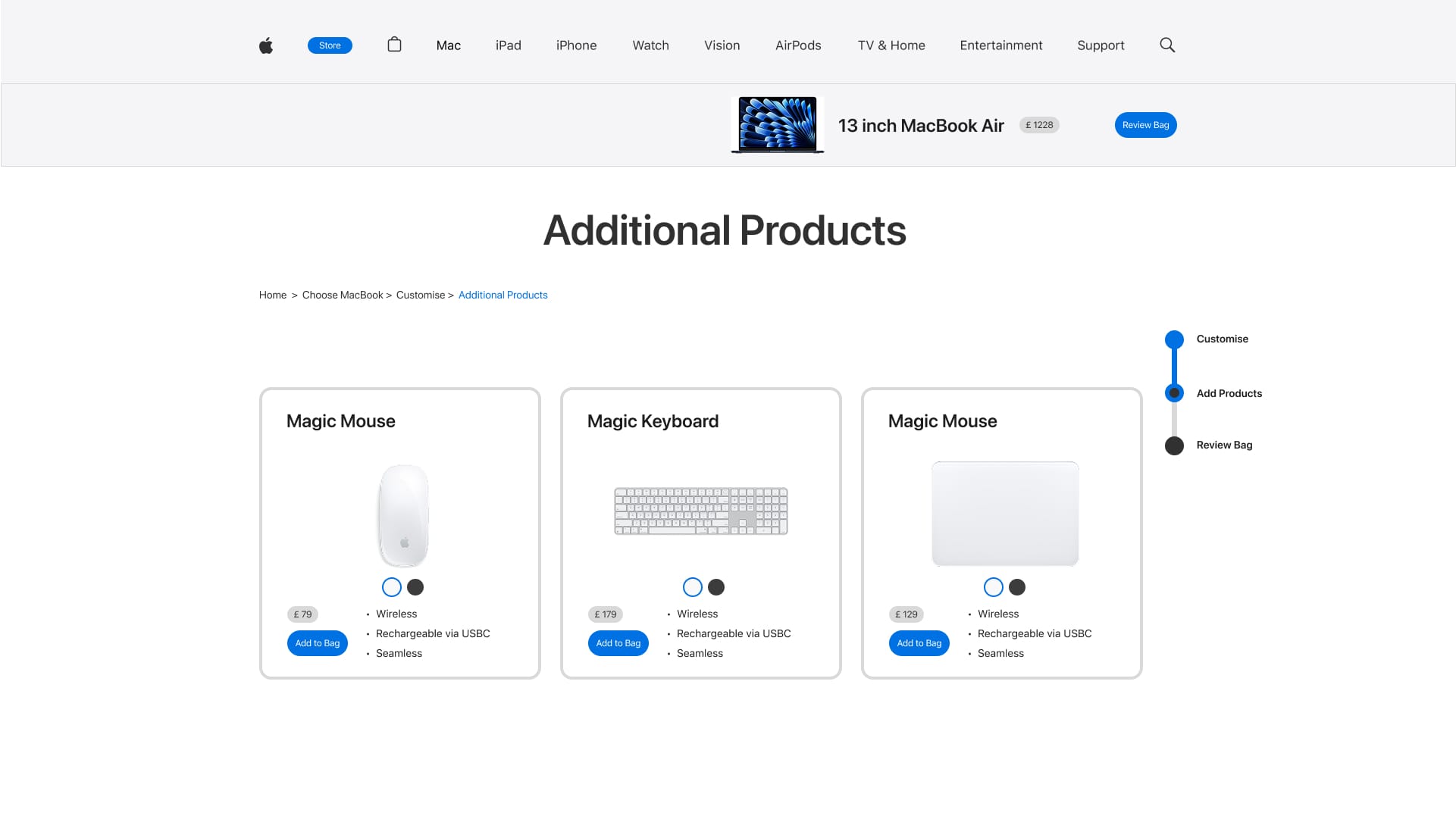
Step 5: Add Products
Step 6: Review Bag
User Persona and Journey:
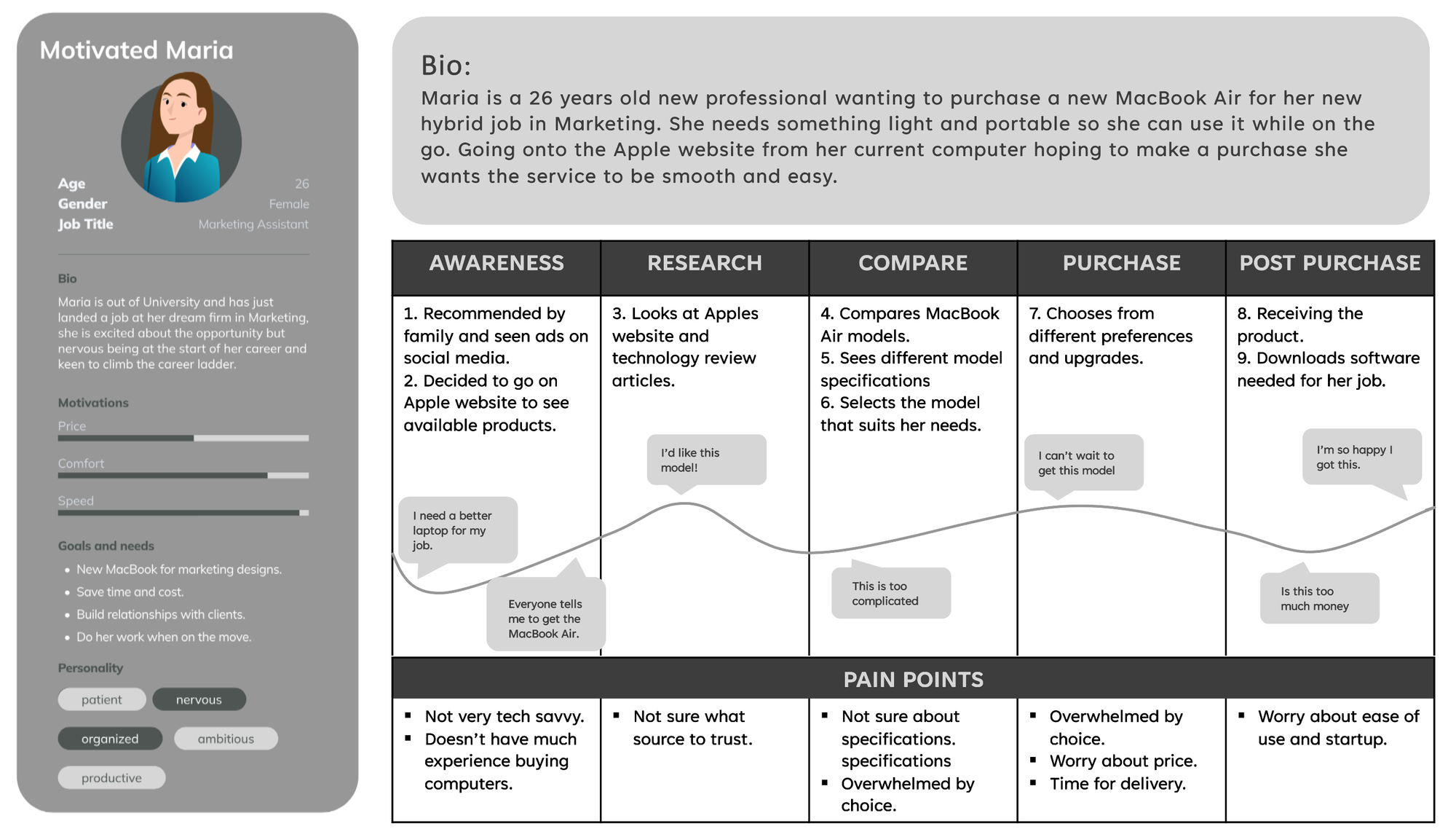
A user persona was designed considering Apple's target demographic, designing a scenario for somebody with not very much technical understanding to consider whether the website would be able to assist with their needs.
Identified Pain Points:
Defining the following pain points highlighted issues that were required to focus on when gathering data:
- Too much scrolling
- Too many pages to click through
- Information overload
- Confusion about tech specifications
03 Data Gathering
This stage informed the user's thoughts through the process. Throughout this, it was identified the main areas to focus on when ideating the redesign.
Participants:
5 participants volunteered to take part in this study, all of which were young adults studying at Edinburgh Napier.
Usability Testing:
User testing session observations and interviews were conducted with 5 participants. Each participant was given the same task and asked to 'think a'loud' their thoughts as they went through the website. Notes were made as the participant went through each of the identified steps in the purchasing process.
Scenario: "You wish to purchase the new MacBook Air directly from the Apple Website. Navigate through the webpage with the intention to purchase the device considering your personal budget and software needs. Explain your thinking and actions as you progress."
Interviews:
Following the observation questions were asked regarding:
- Users experience and opinions about Apple
- Their history of using the website before
- How they found the website navigation
- The success of their set task
- Personal suggestions
Gathered Data:
The following data was gathered from the usability tests and follow-up interviews.
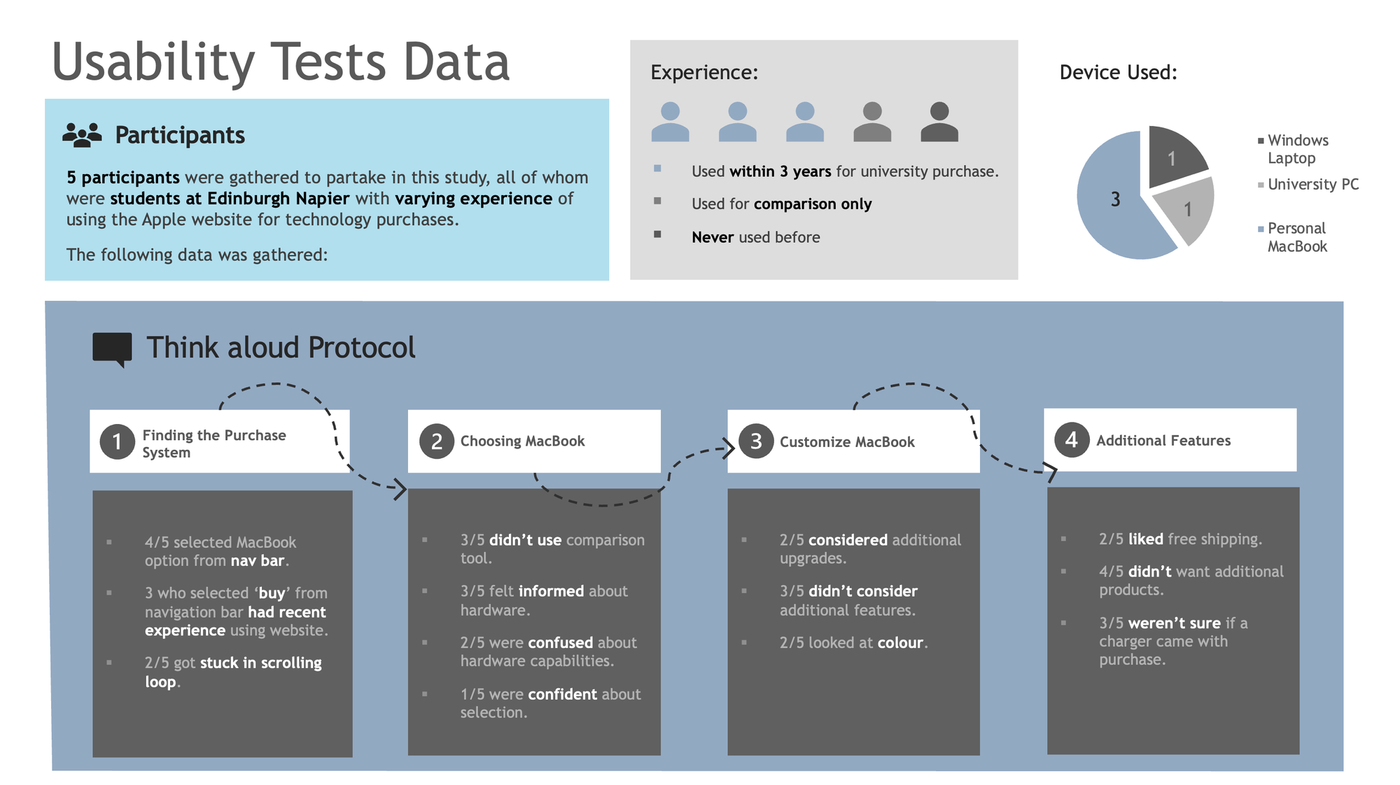
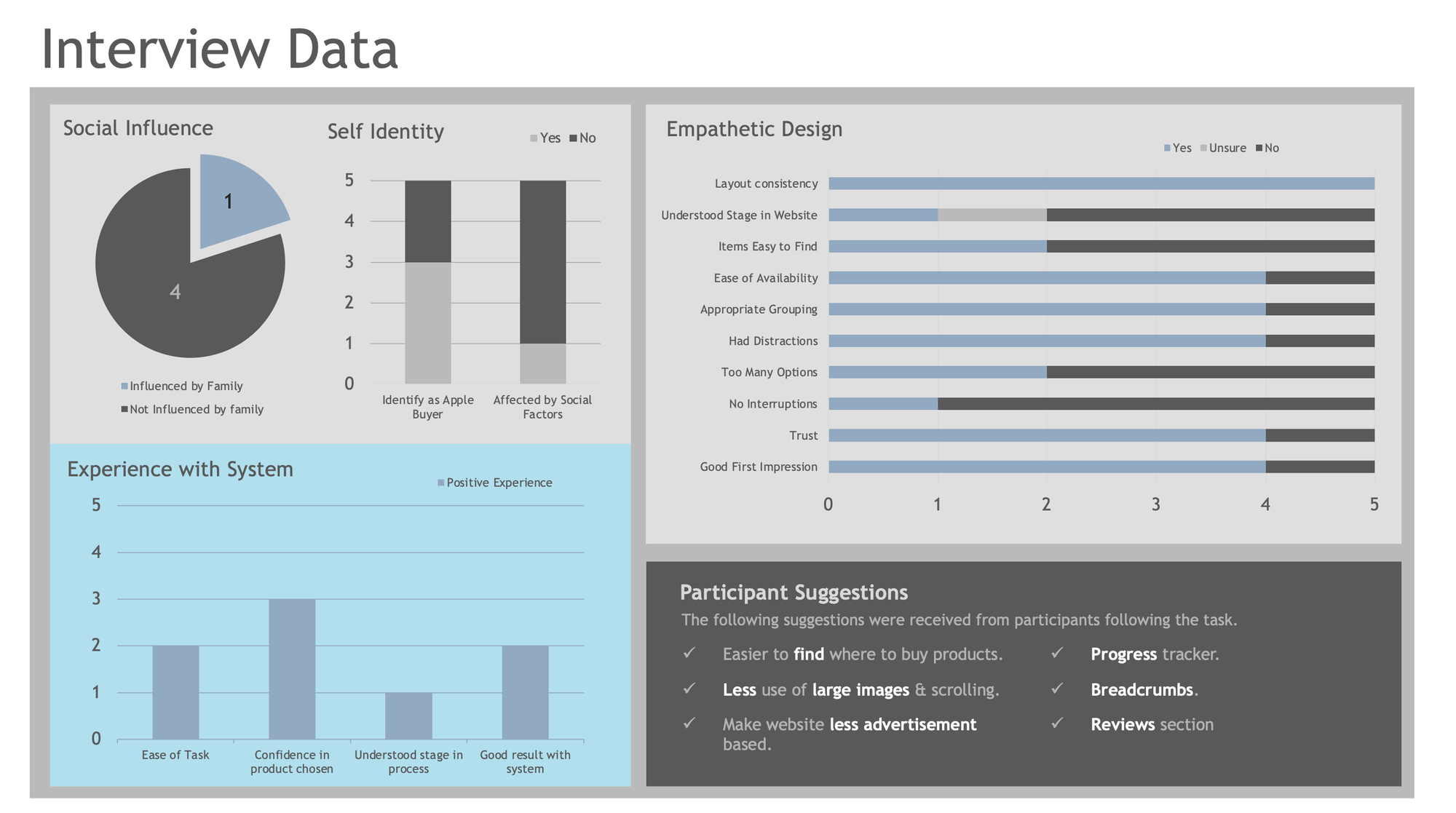
Main problems found:
- Too much scrolling
- Unnecessary pages
- Confusion about where to purchase products
- Unsure about product specifications
- Large images being too distracting
- Confusion about where user was on the website
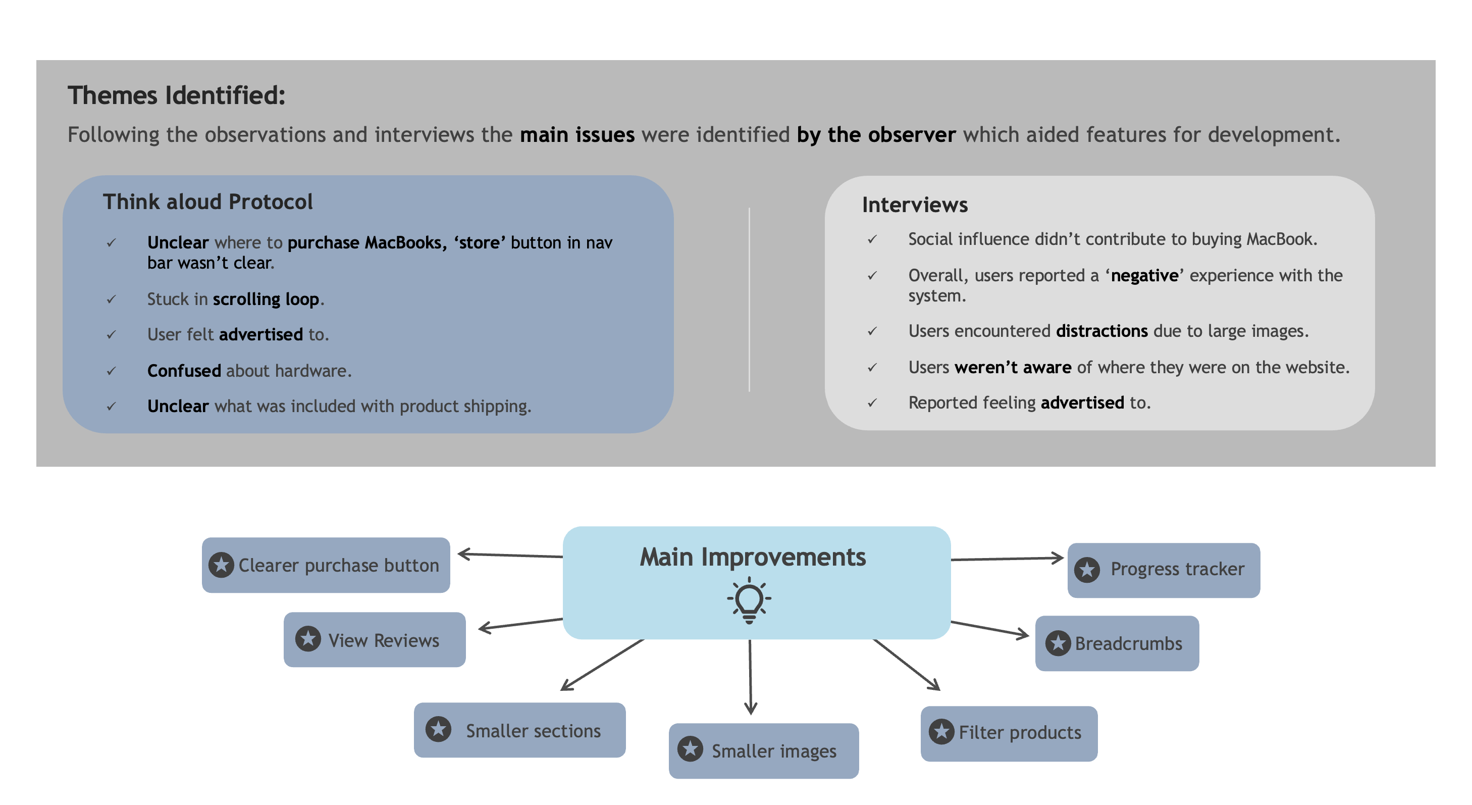
Identified Areas for Re-Design
From the gathered data, themes were identified for the main improvements, informing the ideation re-design phase.
04 Ideate
The ideation stage proposed solutions to the current user interface from the data gathered.
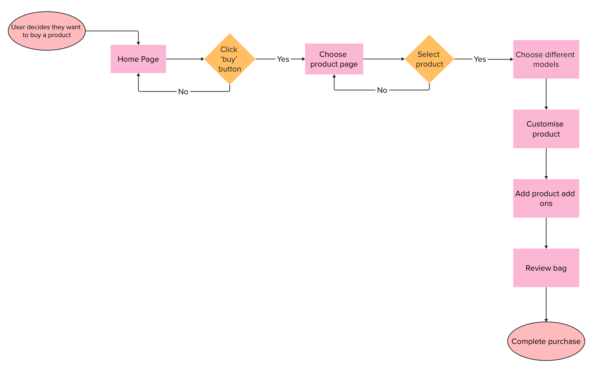
Improved User flow:
The following user flow was mapped out, considering the data gathered, simplifying the steps the user has to go through to purchase a product.
Main improvements:
- Less scrolling
- Fewer pages to click through
- Take users through system efficiently
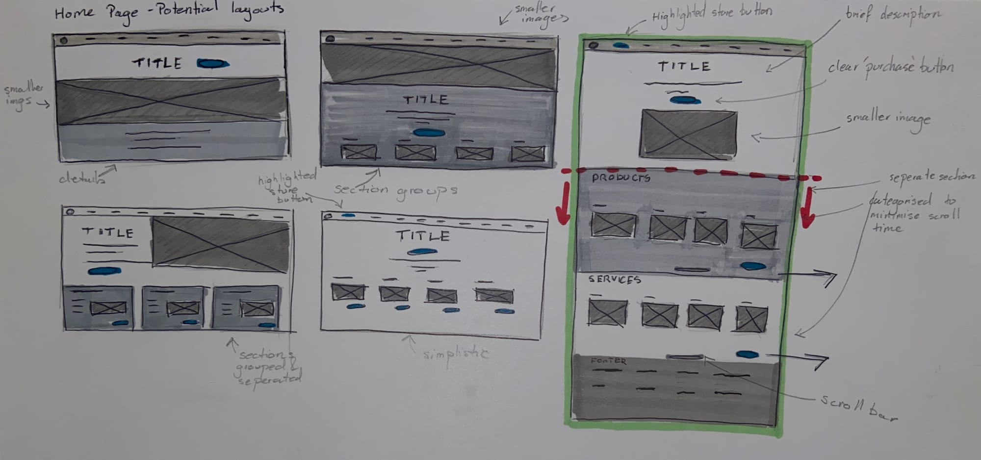
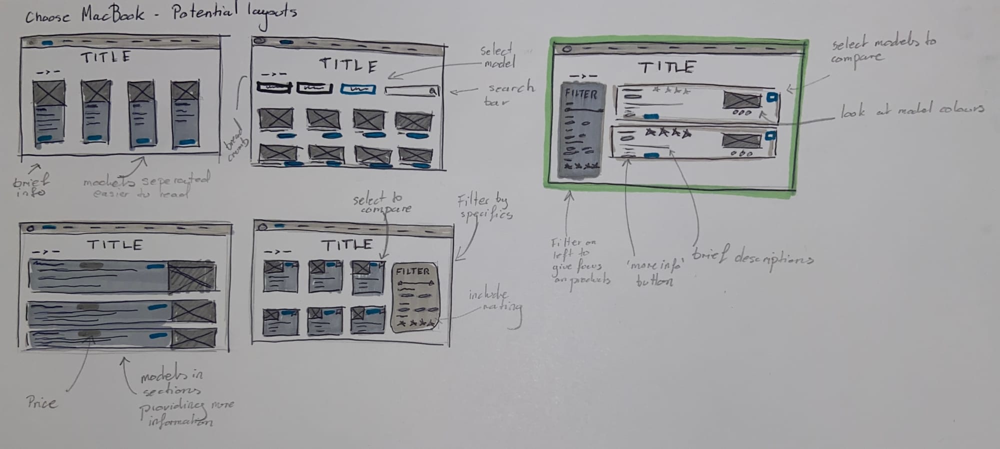
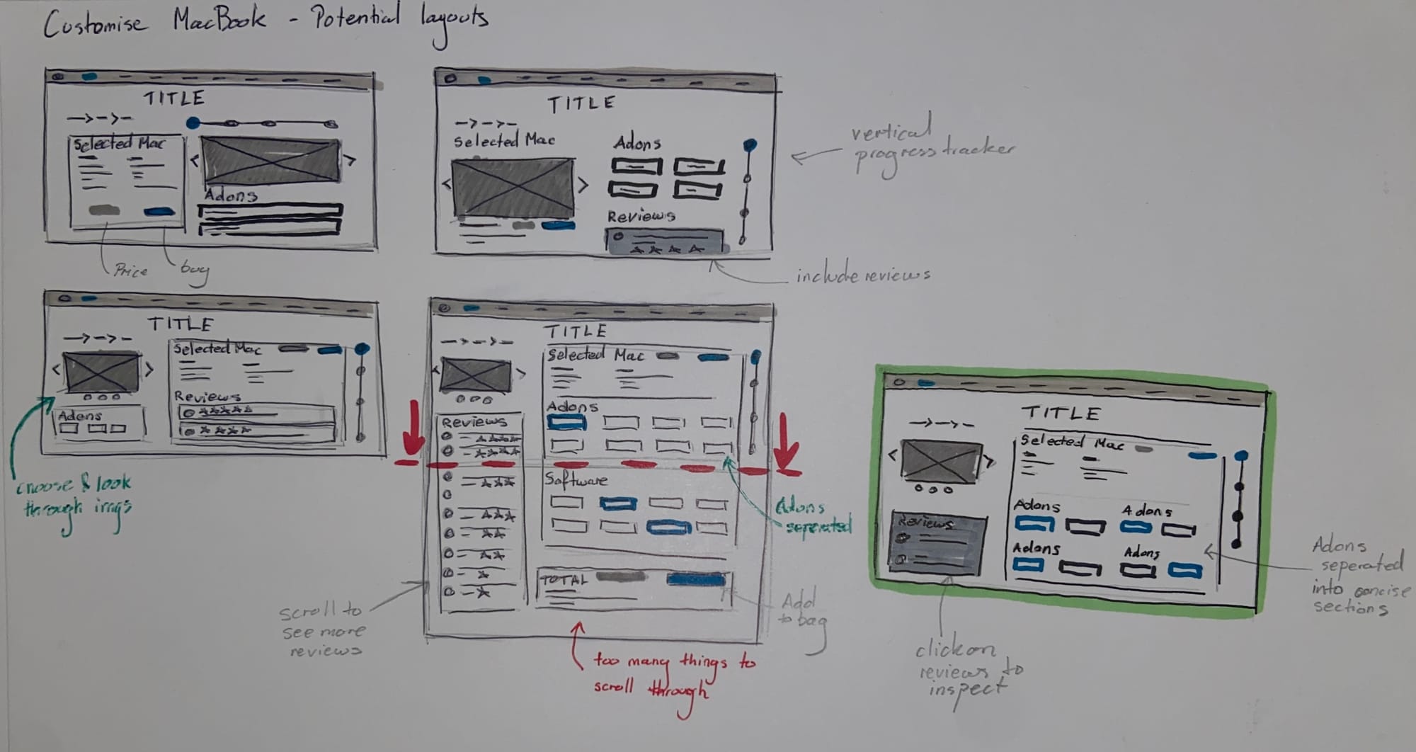
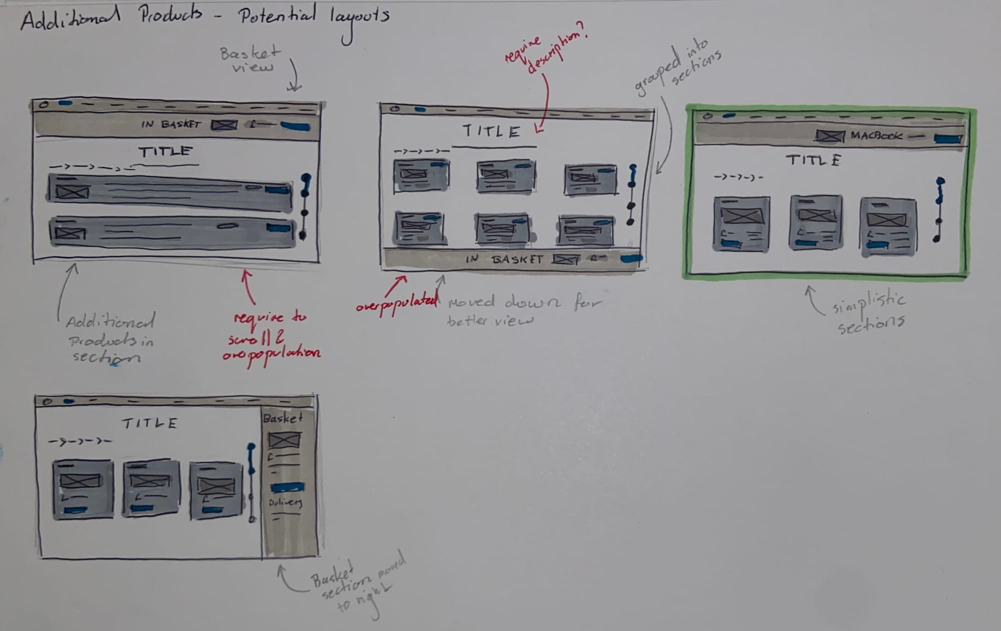
Developing Designs
These quick sketches helped with refining the concept and idea of the screens. During development, consideration was given to how much information the user would see on one screen to minimise scrolling and ensure the user knew where they were in the process and how to get back.
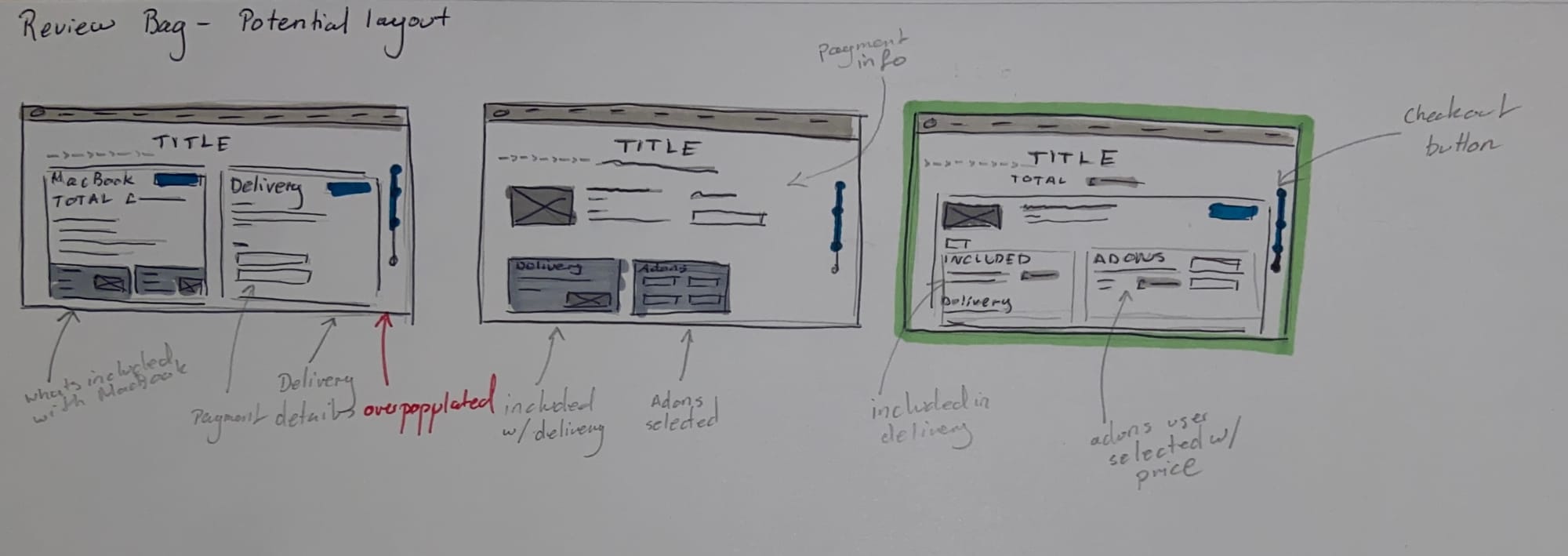
Wireframe Sketches:
From the development stage, I created simple wireframes that displayed the new proposed UI.
Main improvements:
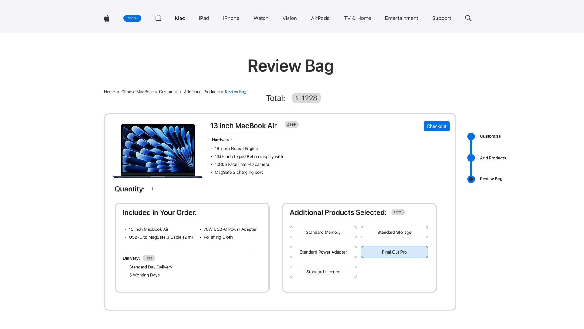
- Breadcrumbs
- Progress tracker
- Information kept on one page - minimise scrolling
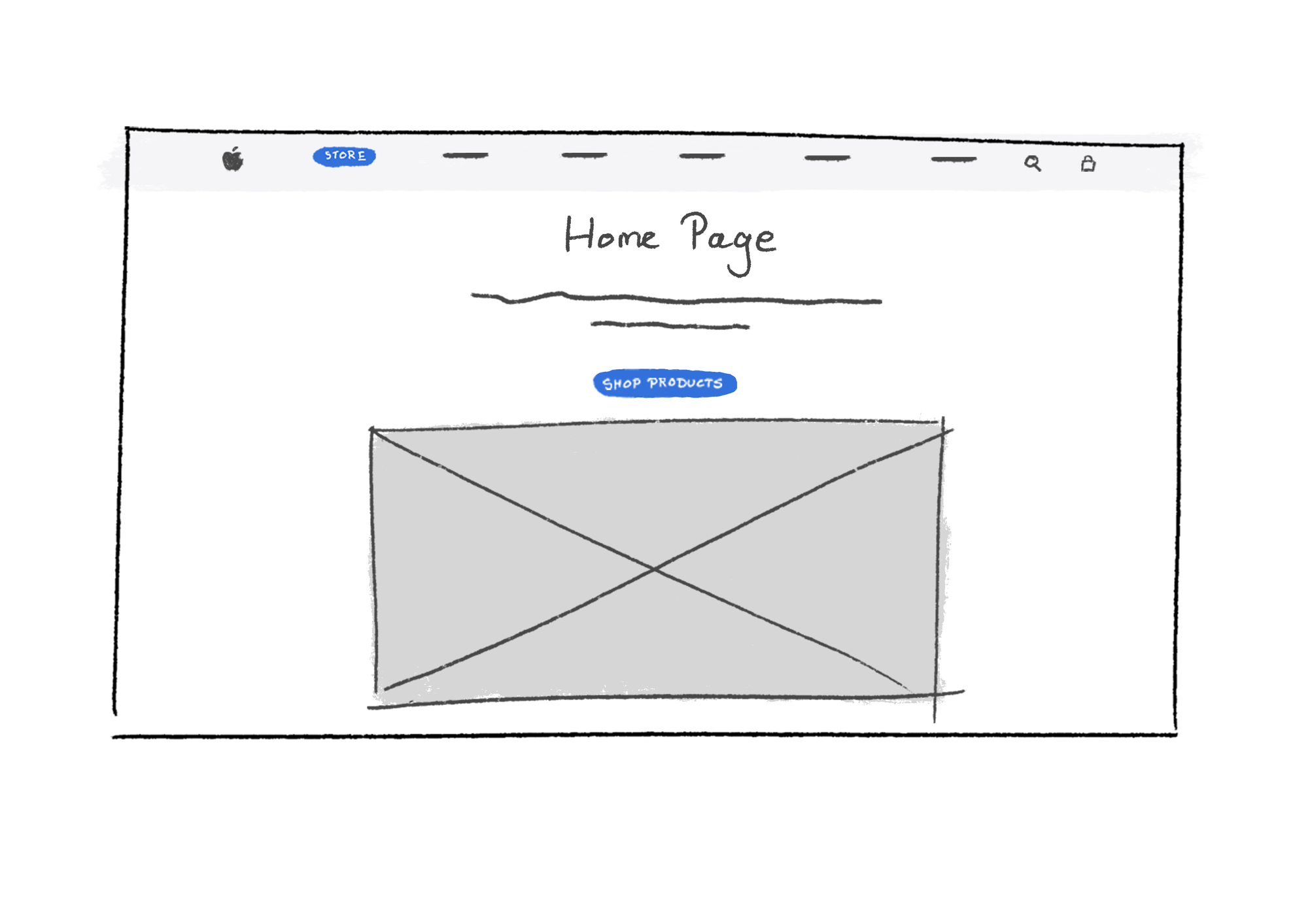
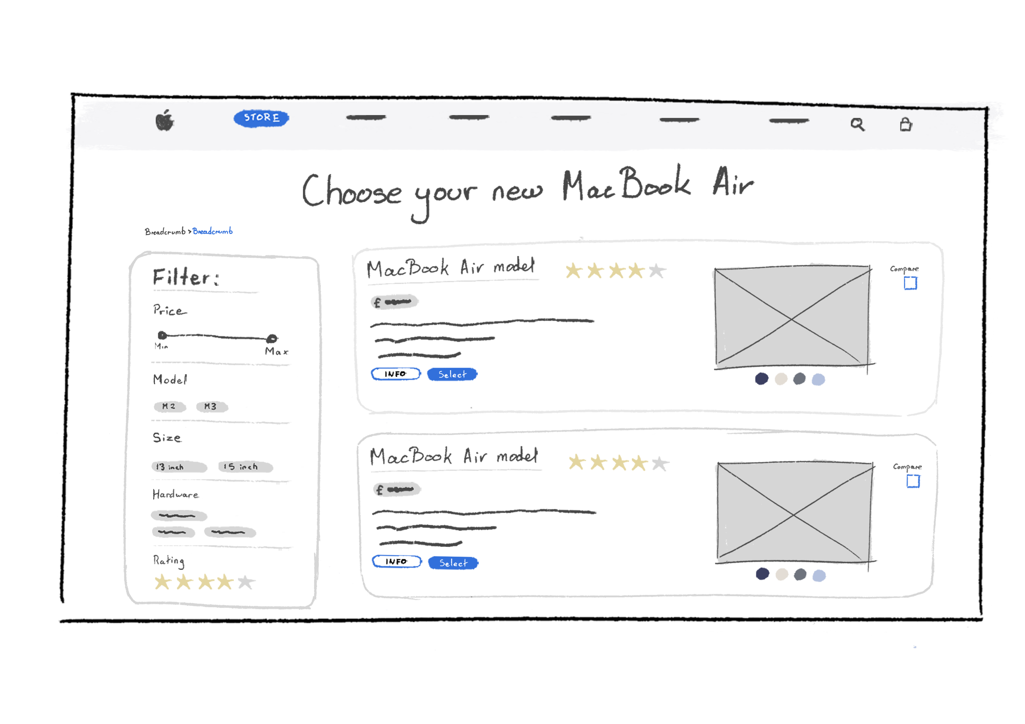
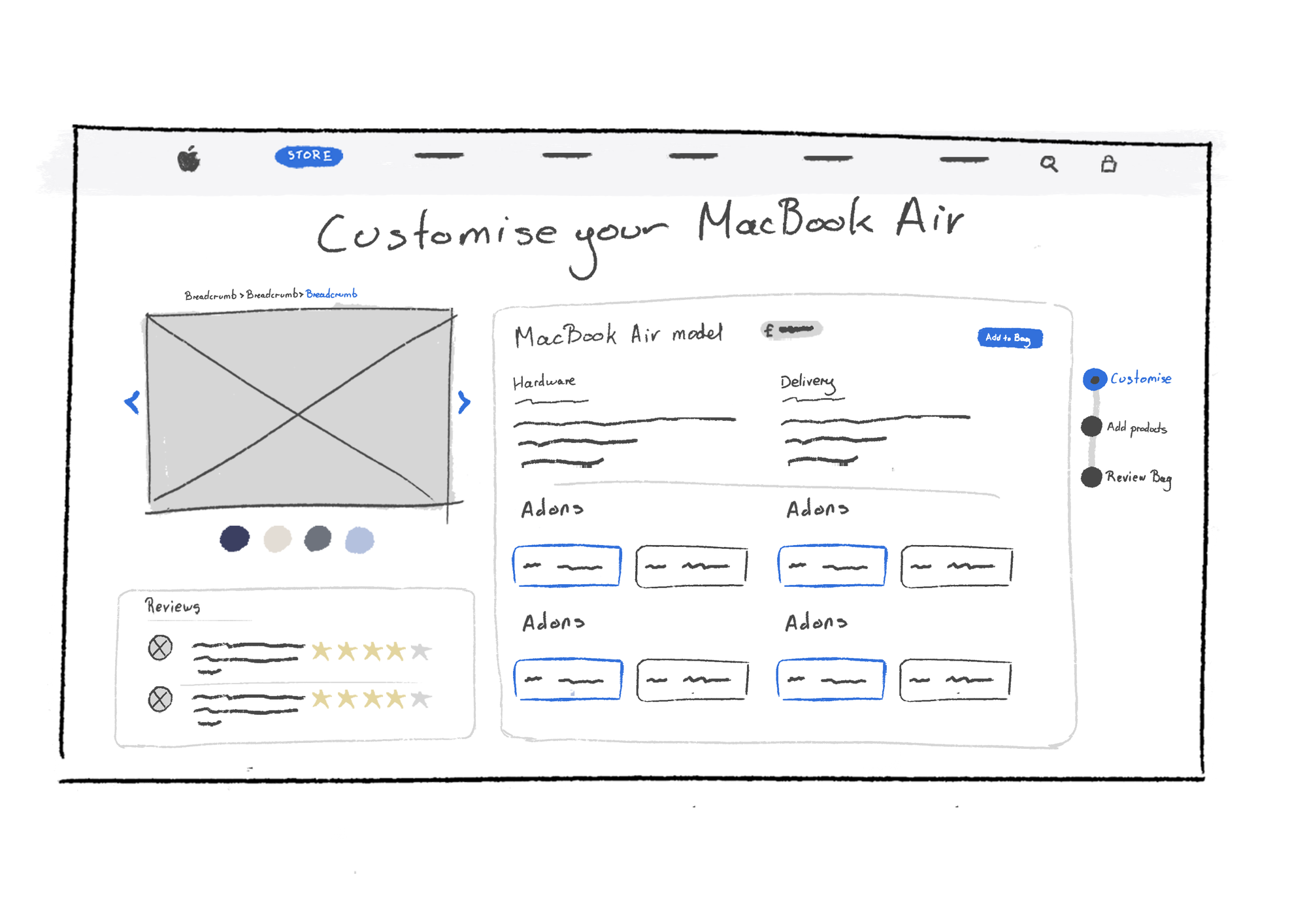
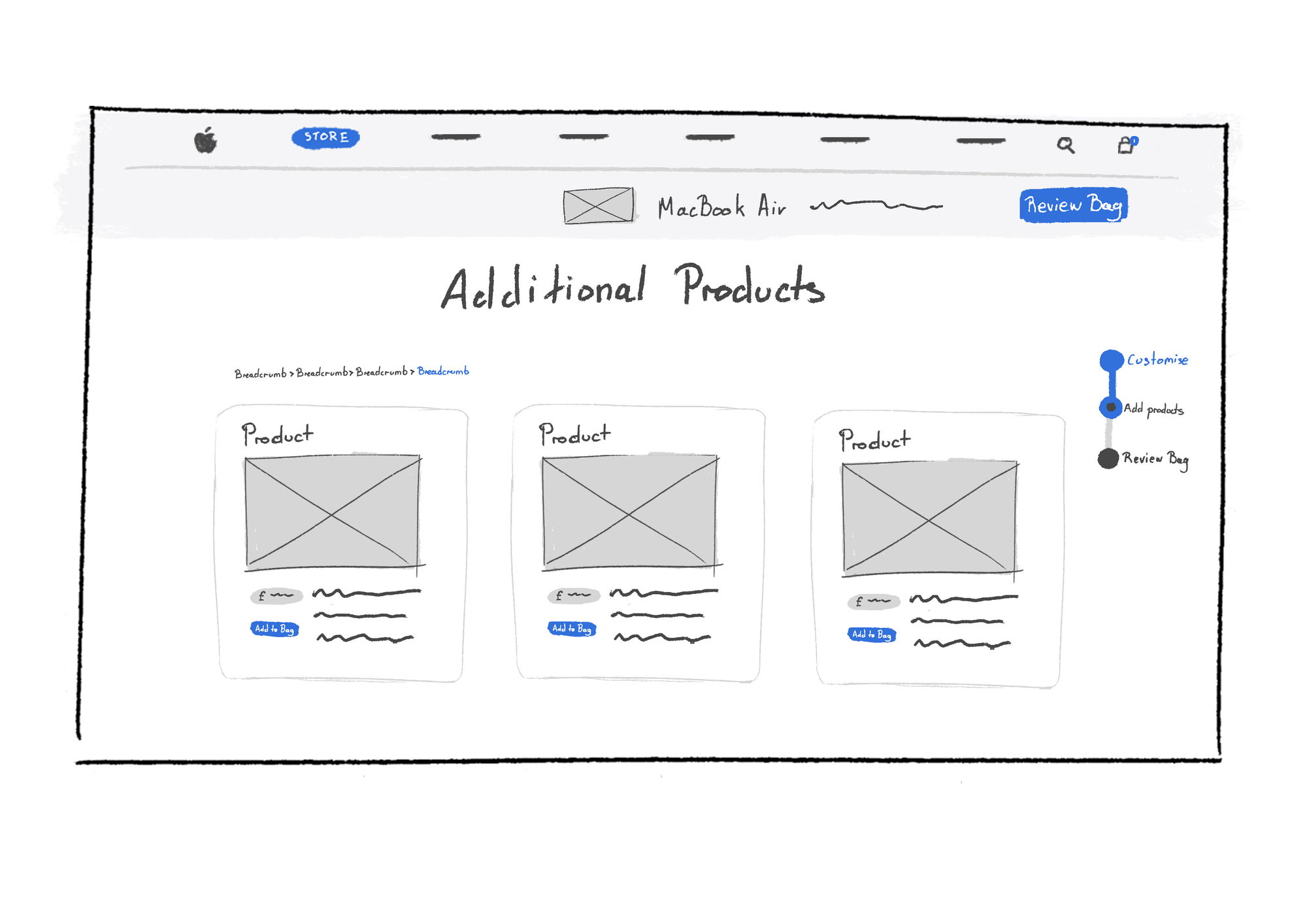
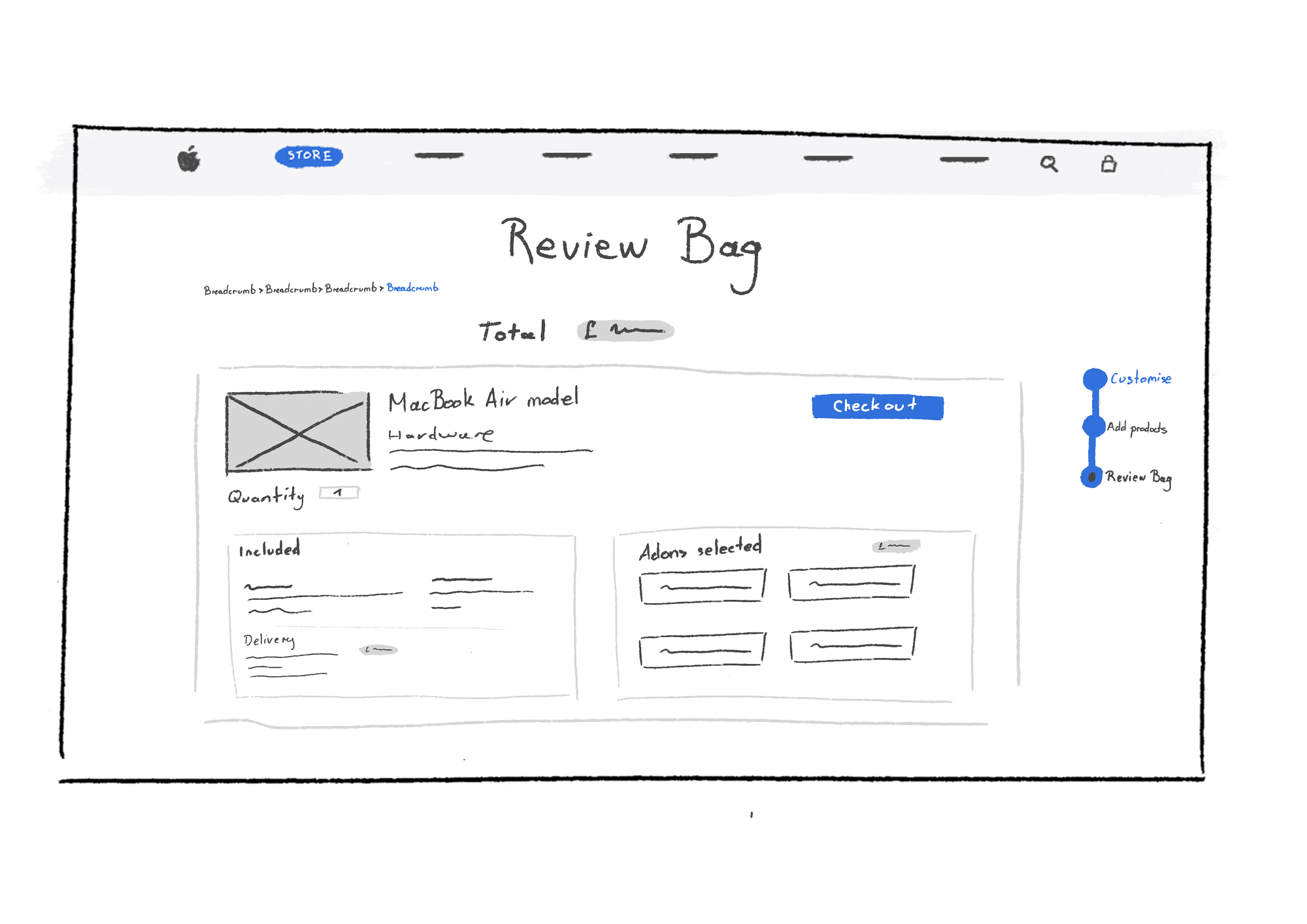
Wireframe sketches
05 Prototype
This stage consisted of creating the developed Figma screens aiming to solve the problems identified.
Before Redesign Pages:
Redesigning Pages:
The proposed wireframes were redesigned using Figma.

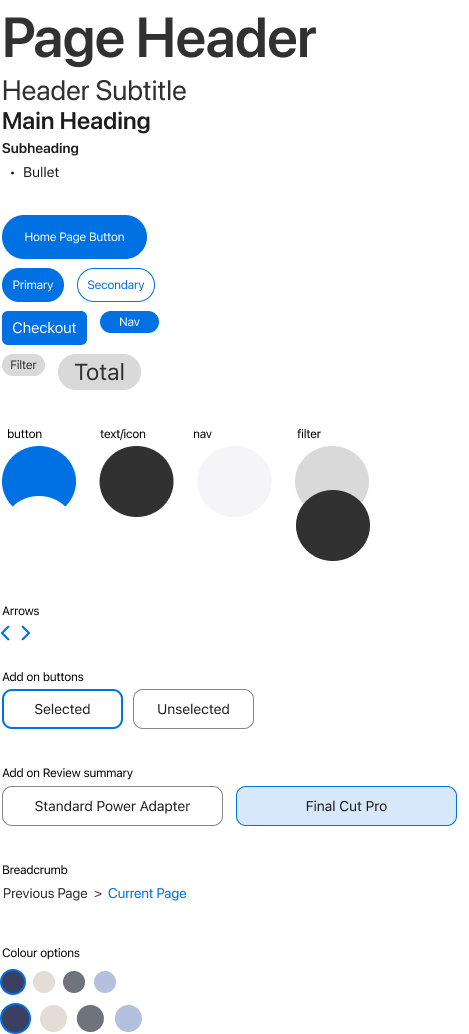
Style Guide:
Adhering to the Apple.com styles and consistencies I created style guide was created when creating the redesigned webpages.
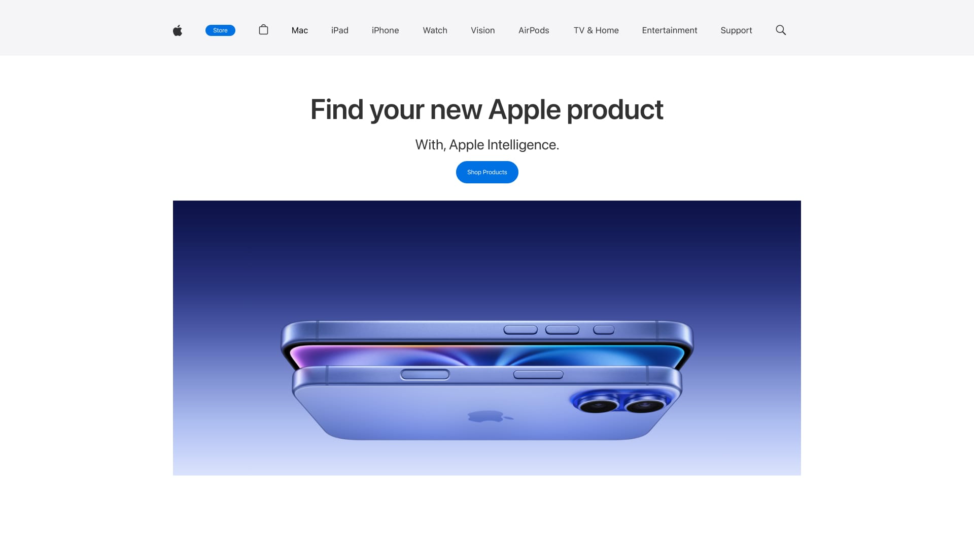
Redesigned Pages:
Below are the redesigned pages that considered solving the proposed problem.
Reflection
This UX evaluation case study provided highly successful results into user insights into using the Apple website for purchasing their products. Throughout this, main issues were identified and defined, allowing for the development of the solutions proposed.
I learned:
- Development of solutions through an identified problem
- Gathering primary data
- Planning, scheduling and conducting usability tests
- Development of cohesive UI through identified themes
Next Steps:
- Surveys and questionnaires to gather opinions on-screen improvements
- Feedback would encourage further ideation in developing a high-fidelity prototype
- Usability testing of the developed prototype - informing its success
Thank you for viewing my case study, some more of my work 😊
